Showing posts with label identities. Show all posts

Wednesday, 29 May 2013

London Music Works: The Film & TV Theme Extravaganza


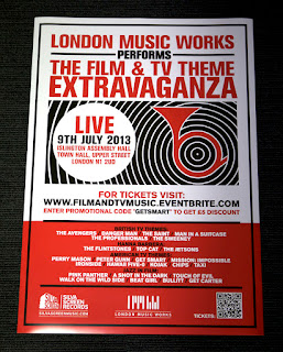
London Music Works presents an evening showcasing and celebrating some of the finest film & TV themes from the 70's and 80's. With the help of a live band, expect an audio fairground ride through the world of funky, cult, pop and jazzy tunes.

Below are a selection of retro styled posters and a short animation I put together to help promote the event, which takes place on Tuesday 9th July 2013 at the Islington Assembly Hall in London. Tickets here and more info here


Metro advert

Original storyboard

Sunday, 12 August 2012

Logotypes and Identities

Choice Cuts Music identity. More info here >

Font Aid IV: Coming Together ampersand glyph. More info here >

Infusion catering service identity. Produced while at Touch

Font Aid V: Made For Japan glyph design. More info here >

Kerraheel wound care product for the foot. Produced while at Touch

London Music Works record and perform film and TV scores

On-One custom mountain bike manufacturers logo

Patterns of Power. See the animated ident for this here >

Flaminal Post-Op scar healing gel. Produced while at Touch

SBMC music industry publishing & rights management company

Silva Screen Masters music licensing service. More info here >

Silva Screen Records refreshed brand identity

Skinkers logo for a digital media agency. Produced while at Touch

UK Space Agency alternative logo for Wired. More info here >

Wednesday, 1 August 2012

Choice Cuts - Print and web identity designs

Choice Cuts is a music compilation series that showcases the best of multi-label artists, songs, soundtracks and recordings. Each series or 'Cut' can be as unique as the next, with a playlist styled towards a collection of songs that can either home-in on a specific band (straight cut), become genre specific (the scenester), showcase the up-and-coming (buzz cut) or simply highlight a diverse mix of music (the unkempt look)!


The point was to keep the Choice Cuts brand simple yet fun so that each series could work individually but still maintain the same identity as the previous, a continuous running joke that will eventually run out of steam when we have to feature a bald-headed artist on the series!

See the website here: www.choicecutsmusic.com

Friday, 25 March 2011

Font Aid V: Made For Japan


'Font Aid V: Made For Japan' is a collaborative design community project which aims to help raise funds for victims of the earthquake and tsunami that struck on 11th March 2011.

My first glyph design is a representation of the scale 9 Earthquake that devastated Japan, fracturing the country and leaving it to be pieced back together through aid and support.

While the second glyph hints at the Tsunami and the dramatic effect it had inland, while also communicating hope as the Eastern Sun rises once again over the waves and horizon.

Combined together these two glyph designs form "9.0" (the magnitude of the event), portraying both the severity and aftermath of the situation, yet also expressing optimism and hope for Japan in the future.

Please donate here: Red Cross

Tuesday, 15 March 2011

Patterns of Power ident #1

A brief ident animation for the "Patterns of Power" logo I designed. The logo and graphic symbols felt like they would translate well into motion graphics, so I thought I'd have a bit of an experiment in Flash and then finished it off by composing 'a little something' in GarageBand. Enjoy!

Wednesday, 16 February 2011

Patterns of Power logo - further developed / final


After long deliberation I decided to take another stab at the identity for 'Patterns of Power'. I felt the last design attempt was a little flawed i.e. a bit rushed, not very modern, 2 dimensional in terms of how it worked as a stand alone logo, plus it almost reads 'poop' at a quick glance (which is never good)! So with a bit more focus and some further understanding of what I actually wanted to achieve, I present the above identity.

The aim of the website it will predominantly feature on, is to showcase both colourful patterns and illustrative shapes, and to also communicate facts and information through stylised infographics and visual data, which I feel this logo is far more representative of. Maybe I can sleep at night now!

Monday, 5 July 2010

UK Space Agency logo concept for Wired Magazine


Ok so not actually comissioned by the UK Space Agency, but Wired Magazine ran a piece on Britain's answer to NASA (our ground control being based in Swindon)! Their analysis of the logo was less than enthusiastic, describing it as "tatty old white-van-man Britain" (not to mention the blatant Doctor Who rip off) and then opened up the challenge for readers to do better alternatives.

Although mine has a subtle, national pride come intergalactic exploration idea behind it, and a more rounded-futuristic looking typeface I might add, I have to say the best interpretation had to go to the person who designed a logo consisting of Admiral Ackbar posing patriotically in front of a Union Jack flag... Genius (just wish I could find a web link to it, see the 'rants' section of July's printed issue of Wired UK)

Thursday, 18 February 2010

Font Aid IV - Haiti benefit font contribution

Below is my contribution to "Coming Together", a font containing over 400 "&" (ampersand) glyphs contributed by almost 400 different designers from 37 countries.

All proceeds from download sales will be donated to Doctors Without Borders


Font Aid IV was organised by the Socitety of Typographic Aficionados and aims to raise money for Haiti earthquake victims.

You can purchase the font from these sites: