Friday 24 December 2010

'In Light of Space' slipcase and hardback book

Below are photos of an imagery based project that was started many moons ago (excuse the pun), and I have finally found the time to complete. The result is a handmade 50 page book full of photographic imagery of light and colour paired up with expressive copy, all designed, written and made by myself.

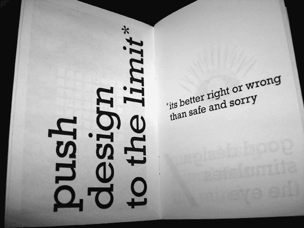
The project was born out of a mass collection of photos I had taken over the years that had begun to pool on my computer, blurry shots of stage lights, fireworks and various other illuminations found at festivals and music gigs. These amateurish snaps begun to get me thinking about the theme of space and how my mishap pics didn’t look too dissimilar from ‘real’ photos taken from the likes of the Hubble Telescope. The copy was the product of some pondering on the subject, a list of possible descriptive words to express the scale of space, some light H.P. Lovecraft reading, a bit of David Bowie listening and a portion of ‘Powers of Ten’ watching.

The book was made using a few different processes, including binding the pages together by hand stitching, creating a hardback cover and spine and finally fixing and securing the pages and cover together using double sided tape and paper engineering to ensure that the book had a robustness to it but would still open fully without breaking or falling apart. Then there was the slip case that would hold the book conformably within, this was created using a net of tight measurements taken from the final dimensions of the book. Once I had these I began to build a more durable structure using card and paper, much to the same thickness as the hardback cover, before finally folding and gluing it into it’s finished box-like shape. The moment of truth was actually seeing if the book would fit within, which was an exact fit thankfully. Very pleased with the final result.

Monday 13 December 2010

PROJECT iPad magazine cover - My re-design


This is my interpretation of Richard Brandson's PROJECT digital magazine cover re-design competition, click here to view my YouTube channel to see a full description and a couple of experimental development videos for the project.

Saturday 4 December 2010

Don't Panic postcard design competition

This is my entry for the Don't Panic postcard design competition for upcoming film TRON: Legacy. The brief was to base the design on the theme of 'Hidden Places' and the idea here is a kind of sci-fi Google Maps for the bizarre world of TRON. Clear navigation and direction through this vast digital wilderness would make it easy to locate 'hidden places' with in, such as the elusive Master Control Program!

Please vote for it here. (Voting starts Mon 6th Dec until Sun 12th Dec)

Sunday 28 November 2010

Anarchy in the UK? - Topical protest designs


I thought it was about time to introduce some angsty design to this blog after watching recent political events unfolding over the last few months. Above is a protest poster / picket sign I have designed to identify with the protests over university tuition fees.

Higher education should be open and available to all walks of life, and raising the fee cap (especially during a period of financial difficulty) will make the prospect of an excellent education and promising future more of a financial gamble and costly experience, something a lot of people just wont be able to afford.


Brilliant minds and vast amounts of wealth aren't always synonymous with each other, take bankers and MPs for example... wealth, but not much going on upstairs of late!

Sunday 14 November 2010

Design Poster

Just having a bit of fun with some typography and tight kerning!

Sunday 24 October 2010

Little booklet design, just for fun!


Wow these blog posts are like buses, nothing for a month and then two come along at the same time! Anyway, pics of a little handmade booklet designed on a whim. Been a long time since I've handmade a booklet, cant blame anything on the printers or finishers here, all responsibility lies with me... the way it should be I guess!

Website page designs


Been a while since last posting anything, but here is development on an awareness/artwork showcase website I'm working on in my spare time (design and content is about 75% there, but I also need to actually built it as well first) so could be quite a while before anything actually goes live!

Tuesday 10 August 2010

Design detail from a little Dreamweaver experiment

Site banner detail from a little web design project I'm working on at the moment, I have no idea what the outcome of this will be at this stage but its really just an excuse to explore a bit of Dreamweaver CS5. Liking the retro colours, but not liking the prospect of disappearing to the dark side and being consumed by html and css!

Monday 2 August 2010

352 favicons, 1 poster, 0 hours sleep


Is it me or do I seem to be using a lot of black and white in my designs lately? (must be the inner goth trying to get out)! Anyway, here's a burst of colour for a change.

Monday 5 July 2010

UK Space Agency logo concept for Wired Magazine


Ok so not actually comissioned by the UK Space Agency, but Wired Magazine ran a piece on Britain's answer to NASA (our ground control being based in Swindon)! Their analysis of the logo was less than enthusiastic, describing it as "tatty old white-van-man Britain" (not to mention the blatant Doctor Who rip off) and then opened up the challenge for readers to do better alternatives.

Although mine has a subtle, national pride come intergalactic exploration idea behind it, and a more rounded-futuristic looking typeface I might add, I have to say the best interpretation had to go to the person who designed a logo consisting of Admiral Ackbar posing patriotically in front of a Union Jack flag... Genius (just wish I could find a web link to it, see the 'rants' section of July's printed issue of Wired UK)

Wednesday 30 June 2010

Glass frame mounted print of symbol designs


A couple of test shots while trying to find some good light without getting too much reflection off of the glass surface... quite difficult it turns out! Colours are nice though.

Saturday 20 March 2010

Fresh off the press - New white foiled business cards


These business cards were white foil debossed onto 330gsm plike, really pleased with the result

What is the significance of the white squares and the black spots? I hear you ask... Well, click here to discover more >

Thursday 18 February 2010

Font Aid IV - Haiti benefit font contribution

Below is my contribution to "Coming Together", a font containing over 400 "&" (ampersand) glyphs contributed by almost 400 different designers from 37 countries.

All proceeds from download sales will be donated to Doctors Without Borders


Font Aid IV was organised by the Socitety of Typographic Aficionados and aims to raise money for Haiti earthquake victims.

You can purchase the font from these sites: