


This album can be purchased from Silva Screen Records


 'Great British TV Themes' is a two disc compilation of some of the most memorable and catchy (albeit annoying) theme tunes from some of finest television shows from the 50's all the way through to the 00's. Included in the track listings are the likes of soaps (EastEnders, Coronation Street); Sci Fi (UFO, Doctor Who, Red Dwarf); Drama series (The Bill, Casualty, The Sweeney); game shows (Countdown, Blockbusters, The Crystal Maze) and of course comedy (Only Fools and Horses, Fawlty Towers, Monty Python etc...) plus many more (54 tracks in total)!


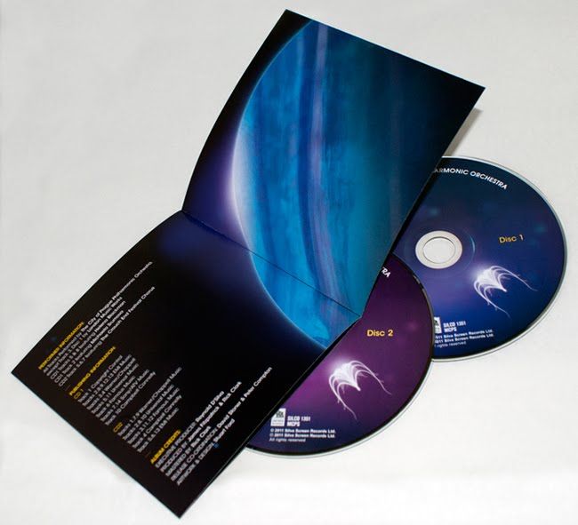

 Here is the final, finished product, "The Music of James Horner Performed By The City of Prague Philharmonic Orchestra". I created the album cover with an Avatar-esque feel to it (one of the more recent films Horner has scored), which I then transferred across the rest of the album design including an eight page booklet, back inlay and disk graphics. This Silva Screen Records release is available to purchase from May 16th 2011 but you can pre-order it online now from the following sites; Silva Screen Records / Amazon UK / HMV / Play.com / Zavvi


 CD cover designs for Silva Screen Records. The album is a collection of James Horner's soundtrack work performed by The City of Prague Philharmonic Orchestra. The artwork draws heavily on the theme of the composer's most recent work, Avatar, using familiar colours and floating bioluminescent shapes and organisms in comparison to the mystical alien world in James Cameron's film. The 'eywa seed' also mirrors a classical string instrument, like a harp.


 'Font Aid V: Made For Japan' is a collaborative design community project which aims to help raise funds for victims of the earthquake and tsunami that struck on 11th March 2011.
 After long deliberation I decided to take another stab at the identity for 'Patterns of Power'. I felt the last design attempt was a little flawed i.e. a bit rushed, not very modern, 2 dimensional in terms of how it worked as a stand alone logo, plus it almost reads 'poop' at a quick glance (which is never good)! So with a bit more focus and some further understanding of what I actually wanted to achieve, I present the above identity.
 'Patterns of Power' is a personal project I am working on at the moment, it will essentially be an online resources website showcasing artwork of repeat patterns, symbols and icon designs created by me in my spare time. Inspired by tribal art, the website will aim to raise awareness of indigenous cultures found throughout the world, highlighting current issues and problems they face. Available on the site will be free desktop, tablet and mobile phone wallpaper downloads, an online gallery and shop (of which, a portion of sale profits will be donated to survivalinternational.org). With these points in mind I wanted the identity to incorporate the repeat pattern/ancient tribal theme, but also look modern and work well across a range of digital media. The result above has been designed to take on a variety of dynamic forms, sometimes as a stand alone logo, a full on repeat pattern, or even as an app/online icon.

