Sunday, 16 September 2012
Super Themes - album artwork
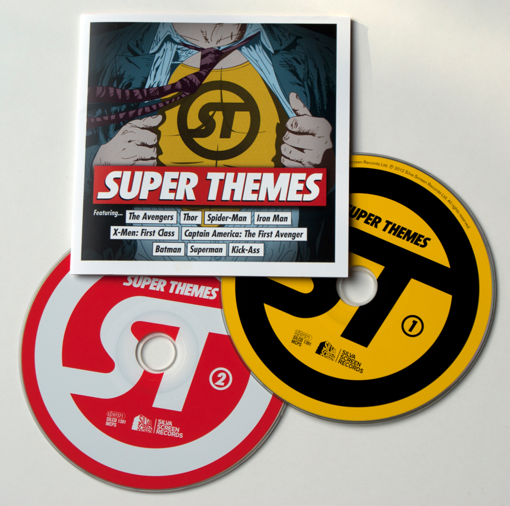
Super Themes is a compilation of super hero theme tunes covering a wide diversity of caped-crusaders from the big and small screen. From Adam West's Batman to The Dark Knight; Superman to Kick-Ass; X-Men to The Avengers… the music that lifts these characters out of comic book pages and onto our screens could be the real source of their super powers.
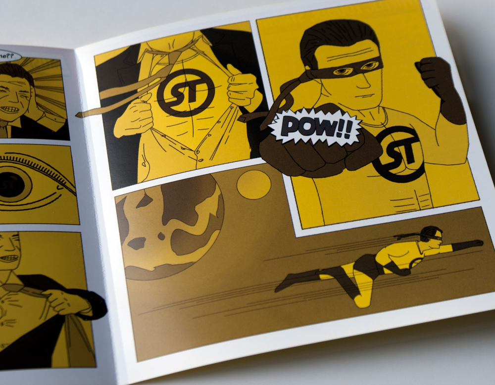
With the origins of these (sometimes) masked crime-fighters firmly in mind, I chose to focus the artwork for this album on the comic book strip, creating and illustrating a story about the power of one catchy theme tune. I also inadvertently turned an 'average Joe' into a superhuman when he is exposed to the music on this album, acquiring the ability to tear off the restraints of an ordinary working man's life and adorn the customary brightly coloured spandex suit and mask!
Album available here: Silva Screen and Amazon UK
Sunday, 12 August 2012
Logotypes and Identities
![]() |
| Choice Cuts Music identity. More info here > |
![]() |
| Font Aid IV: Coming Together ampersand glyph. More info here > |
![]() |
| Infusion catering service identity. Produced while at Touch |
![]() |
| Font Aid V: Made For Japan glyph design. More info here > |
![]() |
| Kerraheel wound care product for the foot. Produced while at Touch |
![]() |
| London Music Works record and perform film and TV scores |
![]() |
| On-One custom mountain bike manufacturers logo |
![]() |
| Patterns of Power. See the animated ident for this here > |
![]() |
| Flaminal Post-Op scar healing gel. Produced while at Touch |
![]() |
| SBMC music industry publishing & rights management company |
![]() |
| Silva Screen Masters music licensing service. More info here > |
![]() |
| Silva Screen Records refreshed brand identity |
![]() |
| Skinkers logo for a digital media agency. Produced while at Touch |
![]() |
| UK Space Agency alternative logo for Wired. More info here > |
Saturday, 4 August 2012
Star Wars Parody Posters: Global Financial Crisis
Here are some politically motivated posters, parodying the iconic Star Wars scrolling intro text.
I decided to write three short statements based on the events unfolding around the financial crisis, but narrate the situation as if it was the preface to a Star Wars saga.
The statements remain scathing and cynical yet bare a slightly comical attitude towards the recession, and it doesn't take too much of an imagination to see the similarities between this real life event and George Lucas' s fictional universe of scum and villainy!
It often feels like our political leaders are living on a different planet to us anyway… sometimes light-years away!
Wednesday, 1 August 2012
Choice Cuts - Print and web identity designs
Choice Cuts is a music compilation series that showcases the best of multi-label artists, songs, soundtracks and recordings. Each series or 'Cut' can be as unique as the next, with a playlist styled towards a collection of songs that can either home-in on a specific band (straight cut), become genre specific (the scenester), showcase the up-and-coming (buzz cut) or simply highlight a diverse mix of music (the unkempt look)!
The point was to keep the Choice Cuts brand simple yet fun so that each
series could work individually but still maintain the same identity as
the previous, a continuous running joke that will eventually run out of
steam when we have to feature a bald-headed artist on the series!
See the website here: www.choicecutsmusic.com
Saturday, 28 July 2012
2057 Climate Change Calendar
I designed this calendar in 2007 to raise awareness about the reported implications of climate change 50 years on if we did not take enough action to prevent its predicted course.
Using the theme of sport to highlight how extreme weather conditions could affect human endurance, from beach volleyball in the scorching month of November to freestyle swimming during summer floods, the message is brought across with the surreal pairing of brightly-coloured, Olympic-esque illustrations and the serious predictions given by scientists. I think the context of humans enduring physical suffering, not for their sport but for their actual survival, helps to convey a far more poignant message. While the calendar aspect also addresses the associations we have with seasonal weather conditions, if we cease to alter our behaviour towards the environment then we may very well see a dramatic shift in these annual patterns. Far worse than simply April showers in May!
Saturday, 21 July 2012
A Recipe For Disaster
I created these posters back in 2007 as part of my final year project at university. The intention was to create a series of attention-grabbing statements, raising awareness about the important social and political topics unfolding at the time. The result was an uncompromising set of written expressions with
thought-provoking and unwavering messages that (unfortunately) even to
this day remain relevant to the on-going issues they address.
Subscribe to:
Comments (Atom)


