'Great British TV Themes' is a two disc compilation of some of the most memorable and catchy (albeit annoying) theme tunes from some of finest television shows from the 50's all the way through to the 00's. Included in the track listings are the likes of soaps (EastEnders, Coronation Street); Sci Fi (UFO, Doctor Who, Red Dwarf); Drama series (The Bill, Casualty, The Sweeney); game shows (Countdown, Blockbusters, The Crystal Maze) and of course comedy (Only Fools and Horses, Fawlty Towers, Monty Python etc...) plus many more (54 tracks in total)!
The design therefore had to be quite colourful and striking, reflecting on the quirky nature of some of these retro television shows.
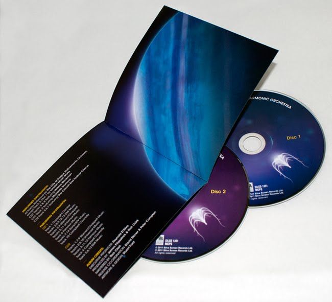
Here is the final, finished product, "The Music of James Horner Performed By The City of Prague Philharmonic Orchestra". I created the album cover with an Avatar-esque feel to it (one of the more recent films Horner has scored), which I then transferred across the rest of the album design including an eight page booklet, back inlay and disk graphics. This Silva Screen Records release is available to purchase from May 16th 2011 but you can pre-order it online now from the following sites;Silva Screen Records /Amazon UK / HMV / Play.com / Zavvi Update:
It is now also available to download from iTunes
CD cover designs for Silva Screen Records. The album is a collection of James Horner's soundtrack work performed by The City of Prague Philharmonic Orchestra. The artwork draws heavily on the theme of the composer's most recent work, Avatar, using familiar colours and floating bioluminescent shapes and organisms in comparison to the mystical alien world in James Cameron's film. The 'eywa seed' also mirrors a classical string instrument, like a harp.
Some of the other films that James Horner has scored include Apollo 13, Cocoon, Aliens, Deep Impact, *Batteries Not Included and Titanic!
I'll post the final outcomes of this project once finished and printed.
'Font Aid V: Made For Japan' is a collaborative design community project which aims to help raise funds for victims of the earthquake and tsunami that struck on 11th March 2011.
My first glyph design is a representation of the scale 9 Earthquake that devastated Japan, fracturing the country and leaving it to be pieced back together through aid and support.
While the second glyph hints at the Tsunami and the dramatic effect it had inland, while also communicating hope as the Eastern Sun rises once again over the waves and horizon.
Combined together these two glyph designs form "9.0" (the magnitude of the event), portraying both the severity and aftermath of the situation, yet also expressing optimism and hope for Japan in the future.
A brief ident animation for the "Patterns of Power" logo I designed. The logo and graphic symbols felt like they would translate well into motion graphics, so I thought I'd have a bit of an experiment in Flash and then finished it off by composing 'a little something' in GarageBand. Enjoy!
After long deliberation I decided to take another stab at the identity for 'Patterns of Power'. I felt the last design attempt was a little flawed i.e. a bit rushed, not very modern, 2 dimensional in terms of how it worked as a stand alone logo, plus it almost reads 'poop' at a quick glance (which is never good)! So with a bit more focus and some further understanding of what I actually wanted to achieve, I present the above identity.
The aim of the website it will predominantly feature on, is to showcase both colourful patterns and illustrative shapes, and to also communicate facts and information through stylised infographics and visual data, which I feel this logo is far more representative of. Maybe I can sleep at night now!
'Patterns of Power' is a personal project I am working on at the moment, it will essentially be an online resources website showcasing artwork of repeat patterns, symbols and icon designs created by me in my spare time. Inspired by tribal art, the website will aim to raise awareness of indigenous cultures found throughout the world, highlighting current issues and problems they face. Available on the site will be free desktop, tablet and mobile phone wallpaper downloads, an online gallery and shop (of which, a portion of sale profits will be donated to survivalinternational.org). With these points in mind I wanted the identity to incorporate the repeat pattern/ancient tribal theme, but also look modern and work well across a range of digital media. The result above has been designed to take on a variety of dynamic forms, sometimes as a stand alone logo, a full on repeat pattern, or even as an app/online icon.
Below are photos of an imagery based project that was started many moons ago (excuse the pun), and I have finally found the time to complete. The result is a handmade 50 page book full of photographic imagery of light and colour paired up with expressive copy, all designed, written and made by myself.
The project was born out of a mass collection of photos I had taken over the years that had begun to pool on my computer, blurry shots of stage lights, fireworks and various other illuminations found at festivals and music gigs. These amateurish snaps begun to get me thinking about the theme of space and how my mishap pics didn’t look too dissimilar from ‘real’ photos taken from the likes of the Hubble Telescope. The copy was the product of some pondering on the subject, a list of possible descriptive words to express the scale of space, some light H.P. Lovecraft reading, a bit of David Bowie listening and a portion of ‘Powers of Ten’ watching.
The book was made using a few different processes, including binding the pages together by hand stitching, creating a hardback cover and spine and finally fixing and securing the pages and cover together using double sided tape and paper engineering to ensure that the book had a robustness to it but would still open fully without breaking or falling apart. Then there was the slip case that would hold the book conformably within, this was created using a net of tight measurements taken from the final dimensions of the book. Once I had these I began to build a more durable structure using card and paper, much to the same thickness as the hardback cover, before finally folding and gluing it into it’s finished box-like shape. The moment of truth was actually seeing if the book would fit within, which was an exact fit thankfully. Very pleased with the final result.
This is my interpretation of Richard Brandson's PROJECT digital magazine cover re-design competition, click here to view my YouTube channel to see a full description and a couple of experimental development videos for the project.
This is my entry for the Don't Panic postcard design competition for upcoming film TRON: Legacy. The brief was to base the design on the theme of 'Hidden Places' and the idea here is a kind of sci-fi Google Maps for the bizarre world of TRON. Clear navigation and direction through this vast digital wilderness would make it easy to locate 'hidden places' with in, such as the elusive Master Control Program!


 'Great British TV Themes' is a two disc compilation of some of the most memorable and catchy (albeit annoying) theme tunes from some of finest television shows from the 50's all the way through to the 00's. Included in the track listings are the likes of soaps (EastEnders, Coronation Street); Sci Fi (UFO, Doctor Who, Red Dwarf); Drama series (The Bill, Casualty, The Sweeney); game shows (Countdown, Blockbusters, The Crystal Maze) and of course comedy (Only Fools and Horses, Fawlty Towers, Monty Python etc...) plus many more (54 tracks in total)!